

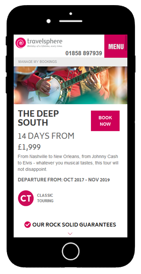
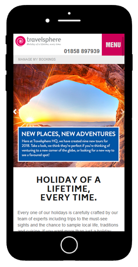
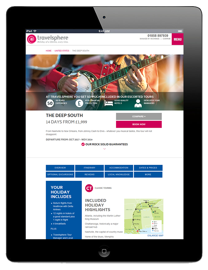
Creating a mobile view of a complex website is always a challenge. Using media queries I was able to tailor the site to suit the portrait layout, as well as changing up the way the user interacts with the content.
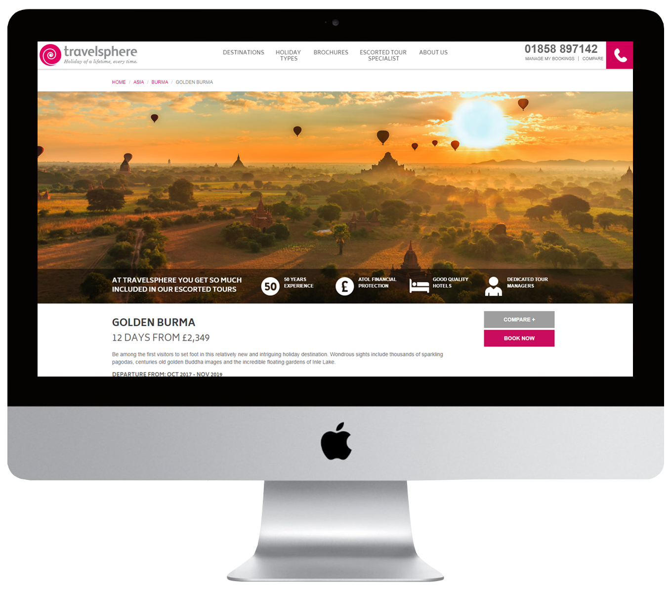
Travelsphere re-branded website: Sept 2017
The website design was based on the re-branding of Travelsphere and I built the website using Bootstrap as a base and plugged it into Umbraco CMS.
I styled it with HTML 5 & CSS with some Javascript (Jquery). This was part of a collaborative project involving the developer on my team and some parts taken on by an agency, namely the search feature.


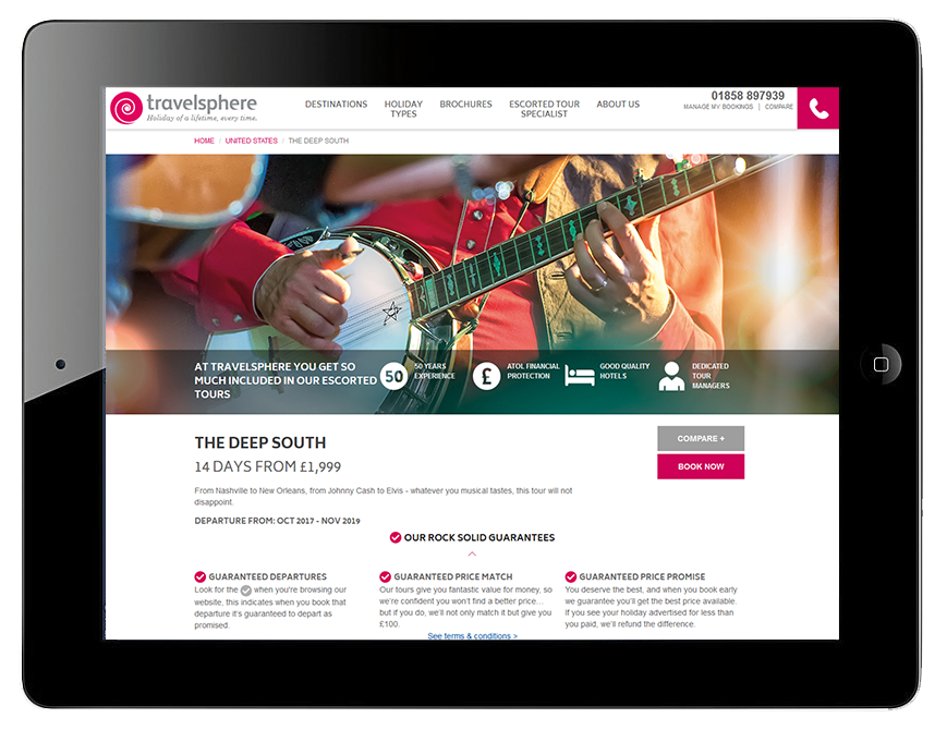
Complex elements for different viewports
This element proved a challenge as it was designed by a print designer, which basically means I had to build something by considering the fact that the content editors would be unable to change the font sizes to make the content ‘fit’, as you are able to do with print. It also had to be responsive to various screen sizes and viewports.
It is a complex mark up which I build using the grid system and data types within Umbraco, allowing the content editors to select the basic elements of text, images and links.
As the viewport reduces to portrait tablets & mobiles, the boxes are stacked differently and various elements are hidden to give more space to the design, removing clutter on the smaller screen.


